
Redesign site navigation and sitemap for both desktop and mobile platforms, streamlining structure that boosted product discovery & mobile CVR.
Swissker is an e-commerce brand offering premium personal care tools targeted at users aged 50+. The site had grown rapidly in content and product lines, but its navigation system hadn’t kept pace — leading to user confusion, missed products, and friction during product discovery.
My role: Lead UX Designer
I led the initiative to redesign the navigation system across desktop and mobile, focusing on clarity, product visibility, and ease of use. This case study outlines my process of research, strategy, design, and refinement — culminating in a scalable navigation structure that directly supports conversion.

Previous landing page of swissklip.com
Menu Structure
As Swissker expanded its product catalog, the original menu structure became unclear and overwhelming:
❌ Confusing category names
❌ Limited hierarchy made it hard for users to understand product breadth.
❌ Inconsistent taxonomy across desktop and mobile
❌ No prioritization based on user interest or sales data
❌ The header layout took up too much vertical space, especially on scroll
❌ Users struggled to find products efficiently — especially on mobile
❌ Product discovery often required multiple clicks, hurting conversion
Business stakeholders also noted that certain high-performing products were under-leveraged in the menu, and mobile CVR was lagging behind desktop performance.
Considering the brand’s aging audience and medical-oriented products (e.g. nail clippers for seniors, UV dental pods), these gaps weren't just inconvenient—they were exclusionary.
User frustration, lower discoverability, and reduced engagement were evident in user behavior recordings and support tickets. Our goal was to create an intuitive, scalable navigation experience that reduced decision friction and boosted product exploration.
I conducted a full audit of the existing site structure, supported by:
Session replay tools (Hotjar) to identify pain points
Navigation analytics: high bounce rates from product list pages, drop-off at menu level
Heuristic issues: ambiguous labels, inconsistent hierarchy, missing affordances

To validate new category labels and understand mental models, I conducted open card sorting with users in our target demographic. This helped:
Identify more intuitive, user-driven labels
Group products based on expectations
Eliminate internal language that didn’t resonate
We're currently running follow-up tree testing to further validate the final structure.

I reviewed how top-performing e-commerce sites (Amazon, Brookstone, Harry’s, Quip, etc.) structure their menus — including:
Hover-based mega menus with featured products
Sticky/floating nav behavior
Clear entry points for customer support & cart access
<div>s, not true <h1>–<h6> tags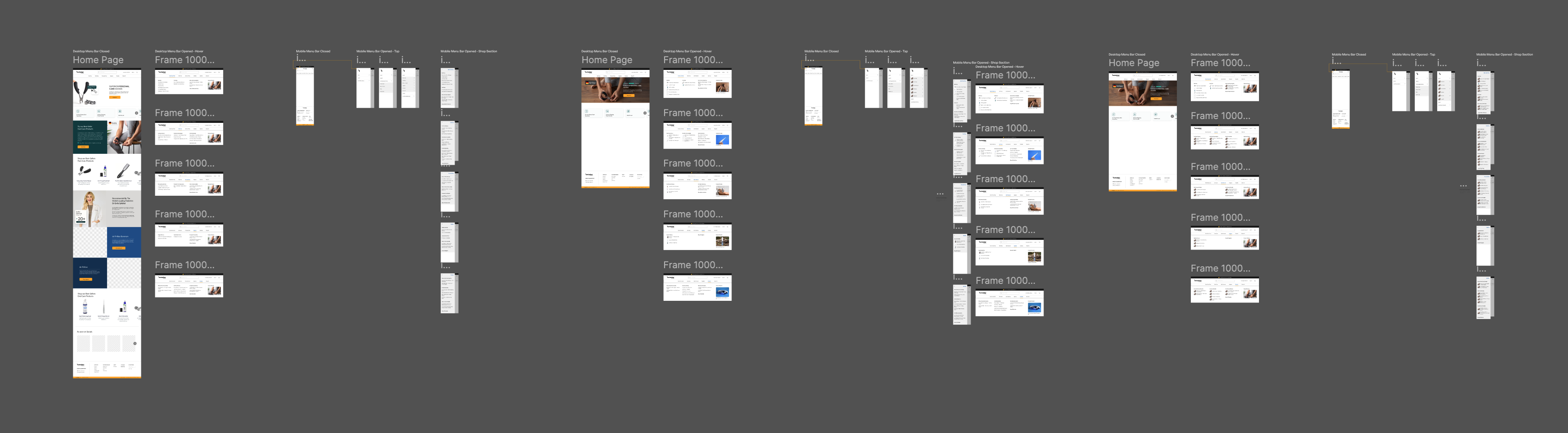
I initially explored a two-bar layout (info bar + menu bar), separating brand functions (search, support, cart) from navigation. But after testing and studying best practices, I opted for a consolidated single-bar layout for simplicity and performance. Why one bar?
✅ Easier cognitive processing — fewer visual layers
✅ Less vertical space consumed, especially on mobile
✅ Faster access to all core actions without scanning multiple zones
✅ Cleaner structure that’s easier to scale and maintain

Nav bar design with two bars

Updated nav bar design with one bar
I developed a new site map and menu hierarchy, organized by user-centered product categories (e.g., Nail & Foot Care, Dental Tools, Skin Essentials). Each top-level item opens a dropdown on desktop with:
1. All related products grouped together
2. A "Featured Product" callout (based on revenue data) to promote top-selling SKUs
Example: LuminiPro IPL Hair Removal featured in “Hair Removal” category.
3. Visuals and images for scanning clarity
Early iterations of the menu were text-only to preserve simplicity. However, usability research revealed that many of Swissker’s tools are unique — and often unfamiliar to new users, especially in the 50+ demographic.
To address this, I introduced product thumbnail images into the dropdown menu as the design matured.

Desktop menu with product thumbnail images
Why it works:
Supports visual scanning and faster comprehension
Reinforces unfamiliar product types for hesitant users
Boosts confidence and delight, especially for seniors and first-time visitors
Highlights key SKUs with stronger visual hierarchy
These images were tested for clarity, performance, and accessibility across devices, and became a subtle yet effective layer to reduce friction and encourage exploration.

First prototype with no thumbnail images

Mobile menu with product thumbnail images
This balanced discoverability with subtle merchandising — helping users find what they want while nudging them toward bestsellers.

Mobile navigation was built from the ground up with a slide-out drawer:
Accordion-style expand/collapse for categories
Persistent access to cart and help
Clear affordances and high contrast for accessibility

.jpg)
To improve usability on content-heavy pages, I implemented scroll-triggered behavior:
Menu hides on scroll down to maximize screen space
Menu reappears when scrolling up, making it easy to change categories or access support/cart without scrolling to top
Especially helpful on long product or landing pages
Why this matters:
Enhances usability for returning users or multi-product comparison
Follows established interaction patterns used by Amazon and other major brands
Improves navigation access without distracting from browsing

While still in testing, early feedback and behavior patterns show measurable improvements:
📉 AOV: ↑ 8.02%
📈 Mobile CVR: ↑ 4.8%
📈 Click-throughs to featured products: ↑ 29.4%
🕒 Avg. time to product click: ↓ 17%
💬 Qualitative feedback: “Finally, I can find everything I need in one place.”

1. Complete tree testing to refine labels
2. Monitor behavior heatmaps + conduct user interviews to validate assumptions
